Wednesday, September 5, 2007

Working at St.Vincent Health

Well since the beginning of July 2007 I have been working as an independent contractor at St.Vincent Health here in Indianapolis. I'm a part of their Creative Services department, and so far, I am loving this job. Since day one, I've been getting back into the groove of non-stop web design--something I missed quite a bit at my last job, which was more IT related.


Though I've done many different projects so far here at St.Vincent, the project I am most proud of so far is the design of the new Peyton Manning Children's Hospital at St.Vincent website.


The redesigned site for the new hospital.


Today, September 5, 2007, the St.Vincent Children's Hospital became the Peyton Namming Children's Hospital at St.Vincent. You can read more about this transition and see my work in action, here. I designed the main splash page, the flash photo gallery, and the general templates that will be used throughout the site. Overall, I'm very pleased to have been part of this event!

Saturday, June 2, 2007

New Website Launch

Well I decided that even though I'm not completely finished with it, I would just go ahead and launch my new site. What I currently have is great, but I'd still like to add some thing and modify many others. But it is a very clear improvement from my previous website. Anyways, I'd just like to take a second to recognize some resources I used and to thank them.


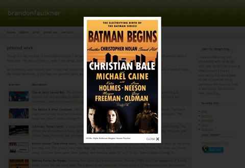
In my new site, I wanted to avoid having a simple gallery where everything was just a thumbnail that, when clicked, went to a different page to see a larger view. To get away from this, I incorporated Lokesh Dhakar's lightbox2 script. Although recently I started studying and learning JavaScript on my own, I was still nowhere near creating something this amazing. His lightbox2 script can be found at:

http://www.huddletogether.com/projects/lightbox2/


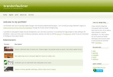
Here are some screen shots of the new site and one showing what the lightbox script does when a thumbnail is clicked:

Portfolio Screen Shot


After Clicking An Image


I used and modified a template from http://www.freecsstemplates.org/ to create my site. Although I plan on modifying this much more heavily, it was the perfect basis for my new site. Thanks be to them for their lovely templates!


So anyways, like I've said, it is still very much a work-in-progress, but to be honest... my last portfolio really was not an accurate representation of my skills and I really needed something that stood out more. I designed this new one in the hopes that it would do me justice much better than my last few designs and I'm very happy with the results. Be on the lookout for frequent updates!

Wednesday, May 30, 2007

The Making of the Cereal Box

I just wanted to expand upon a short description I've given on my website regarding the cereal box project. I didn't want to bog down the print page of my portfolio with all of this, so I'm just putting it here and linking it.

In the Fall of 2005, during my third semester at IUPUI, I took a class on the Principles of Creative Design. Though everyone in the class had really only experienced the basics of design, and only knew a handful of techniques and software applications comfortably, that class ended up being one of the most enlightening and fun classes I have taken to date. Both the curriculum and the professor pushed us and helped us to do some great projects. One of our last assignments in the class was to design a cereal box with a specific audience in mind. We needed to create a cereal box that would be appealing enough to kids so that, if they were walking down the cereal isle in the grocery store, they would pick our cereal box over all of the others. The other factor was the need to make it appeal to adults in the way that it also needed to be marketed as nutritious.


The way we went about catching the children's attention and the way that we tried to entice the adults was completely up to us. The only real requirements were that the box needed to be standard size and, when assembled, needed to be able to be structurally sound enough to hold a 15 oz. bag of cereal in it. I chose to design my cereal box around the cartoon of Tom & Jerry. I figured that Tom & Jerry would still capture the kid's attention as well as still be familiar to the adults who remember the show, or some form of it, from when they were younger. I also tried to make the cereal appear nutritious by marketing it as sugar free, and it also contained higher-than-usual daily values as far as vitamins and minerals go on the nutrition facts panel.


With my primary target audience in mind, the children, I set out to design a box that was colorful and familar. I felt the cereal itself needed to be shown on the box and it needed to be unique to that specific cereal. So I went out and bought a box of Fruit Loops and picked out all the red and blue pieces. I put those in a bowl and did my best to make it look appealing. Although the actual photo itself could have been better, it made all the difference in the final design and really sold the cereal. On the front, I made sure the text was very cartoony and I made sure that Tom and Jerry were very present in the design. I took a picture found on the internet and redrew it as a vector image. At the time, I was not very familiar with vector drawings, but I think it turned out fantastic given my inexperience. On top of all this, I made sure it was shown to be "Sugar Free!" to draw in the adults.


The back of any cereal box is comparable to the Playland at McDonalds. What you're eating may be great, but you need something fun and memorable to do while eating it. I decided to make a simple coloring panel on the back. I again redrew a much smaller raster image into a vector, expanded it, and took out all the color. Also on the back I made sure the text was big and loud and stood out. At the bottom, there were some typical jokes and another vector of Jerry.


Finishing up, I started from scratch and laid out the nutrition facts precisely, all the while altering the numbers to make it appealing to adults. The other side panel was just some ads I had seen on the cartoon network site. I finished up the box by adding all the usual cereal box brandings, labels, and markings to add authenticity.


I got the large cereal box layout printed at PIP Printing on their plotter since it was too big for their usual printers that could print on heavier stock. I carefully cut out the layout, glued it with spray adhesive to a poster board, carefully cut that all out after drying, and was ready to fold and assemble. The box fit together perfectly, thanks to planning, and turned out great. Like I said, it was one of the more enjoyable projects I've ever done and everyone commented that it truly did look like any box you would see in the grocery.

Friday, May 25, 2007

First Glimpse

Well, I've been working at a little less quick of a pace than I probably should be. The problem with redesigning your own website is that if you aren't getting things accomplished quick enough, the only person you're letting down is yourself. I decided to set some deadlines for myself with this site and I'm hoping to adhere to those deadlines fairly closely. I'm not going to announce the dates on here because, well... I'm not the best at keeping this thing updated, and although the site may be done, I may not update this blog for a few days or even weeks after the fact.


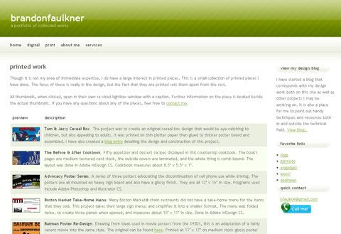
Anyway, here is a quick first glimpse into what the site will look like:
Screenshot of website
I will give more credit where credit is due later, but I'm borrowing and modifying a few snippets of code and some scripts from some free sources to really try to make this site more innovative than my previous work, and I'll document those more officially later.


Just a little random thought and kind of a side note; I accidentally started typing out the code for a link with my caps lock key on, and I remember in high school when I was taking my very first web design course, we were taught it was standard practice to capitalize pretty much every piece of code. I also remember my instructor introducing us to the concept of Cascading Style Sheets and nobody understood its use. Keep in mind, this was back in the dark ages of web design... everything was animated, pages were cluttered beyond belief, and having content meant that there were actually words on the page somewhere. *shudders*

Tuesday, May 8, 2007

Let's Get This Show On The Road

Well, this past Saturday, I officially finished my Junior year at IUPUI and I consequently now have more time to work on the site as well as many, many other projects I've been meaning to get to but didn't have the time to do so. The biggest project being re-designing my portfolio site.


It just amazes me at how fast things are moving in the web design and development industry these days. Blink and you'll miss something, HUGE. Unfortunately, I blinked sometime in the past year and missed fell behind in a few critical things.

It goes without saying that there is a clearly defined level that designers are almost expected to meet nowadays. Web 2.0 is an old term at this point and it seems that it's simply no longer good enough to just have a standard informational website. Interactivity is the name of the game, and I'll admit... that is where I need to get caught up the most. I've recently been introduced to .asp pages after not quite knowing much about them, let alone utilizing them. In my upcoming site design, I'm definitely going to try my hand at some .asp programming, as well as (hopefully) some advanced Java/AJAX.


Anyway, today I finally was able to get back into the swing of things. I dusted off an old CSS file I had been experimenting with and started developing that. So far, it's turning out just as expected. Lots of tweaking and researching best methods and practices for doing things the right way. As for the overall design, I have a fairly simple layout in my head that I hope to make a reality in the coming days. Though I really would like to avoid this whole cookie-cutter Web 2.0 general design, it's looking as if it will follow along those lines. I figure, it's popular and mainstream for a reason: it's effective! So I hope to have more of a report on the progress of the site and other aspects next time.

Wednesday, April 25, 2007

In The Beginning...

Well this is where it begins. Some people will say that the introduction is the most important part of a blog. It tells the readers what to expect, when to expect it, and it shows them the quality of posts yet to come. Well folks, if that's the case then stop your search for all of that which is listed. The truth is, I have no idea what I'll be posting in this blog. What I can tell you is, I'm Brandon and I'm a 21 year old college student studying Computer Graphics Technology in central Indiana. My official course of study falls under an Interactive Multimedia Development category, but I'm interested in an absolute slew of other topics as well. My main focus currently is web graphic design, but I've always wanted to get into more printed pieces.

My official portfolio is found at: http://www.brandonfaulkner.com. One of the things I will accomplish with this blog is take you through the reworking of my current website. I hope to provide links to the resources I am finding in my project to completely redo my personal portfolio. Along the way, I'm sure I will encounter some off-topic but still related things to write about, in fact I have one right now, but I will try to stay on topic as much as possible.

Having said that, one of the best things in the tech industry is cheap tech equipment. There is a nifty little site called http://www.woot.com and they do the whole "one day, one deal" things where they put up an item and it alone sells all day or until it is sold out. A new item is offered every day, ususally... but today is what they call a "Woot-Off". A Woot-Off is an event that lasts 24 to 72 hours where Woot fires off items one after another. Once one item sells out, another item is instantly put up for sale. If you're looking for great deals on tech equipment, look to Woot on a regular basis.

I think that's gonna do it for today. Hopefully you have a sense for what will take place here and though there's not much to look at right now, I hope that you'll come back and check in to see what's happening in my world on a regular basis.